Time to read [8 minutes]
Takeways
- About one-third of Manhattan condo resales sold for less over the decade, which is a typical outcome in stable markets.
- Many submarkets can show annual losses even when overall prices remain flat.
- Negativity bias drives market narratives; long-term data reveals limited real price gains in many cities.
A recurring misunderstanding by many observers of housing markets is that all submarkets do not perform consistently. I’m going to attempt to explain this here.
This week, a brokerage firm released a study about how one-third of Manhattan condo resales have sold for less over the decade. I have been interviewed about it a few times and have been asked about it via audience questions during presentations this week, but I can’t find the report online. The study is described in The Real Deal: How likely are losses in Manhattan’s condo market? For the record, a one-third market share of resale decline is probably not extraordinary and needs some historical context. In the world of averages and medians, many properties sell for less in a region that shows stability. Urban Digs and I have been talking about how Manhattan has mainly been flat for the past decade. “A little up and a little down.”
There is a broader obsession with tracking housing market history to have context and extract pearls of wisdom for use today. Back in 2010, a sharp freelance investigative data journalist hired by The Real Deal researched Manhattan housing prices back to 1910. She met with me at my office, and I shared a little insight and current data, but my data only went back to the 1980s at the time. She relied on a once-dominant but now defunct New York publication, among other sources, and dug in. The award-winning research currently resides behind their pro-product paywall, but I remember a chart showing how housing prices took a crazy steep climb just after World War II. Two years later, I approached the century of data research differently for an article I wrote for Elliman Magazine. I looked at each decade of Douglas Elliman’s then-100-year history. I extracted data from the New York Times classified ad archives (remember this when you read the WaPo reach near the end of these notes). Clearly problematic, but I was trying to extract a top-level perspective, and the same pattern emerged. Housing prices took off in the 1950s. I also found some quoted market observations from the early 1920s that sounded like they were said today.
Back in 2003, I was walking out of the Manhattan subway station at 59th and Lexington Avenue and strolled by a newsstand on my way to an appraisal inspection. Sitting on the sidewalk was a pile of the day’s freshly delivered New York Post tabloids, still tied together with a thick string. I noticed that the top copy had “my” average sales price number of $850,000 screaming across the cover. I was really excited to see it in print. Shortly afterward, I saw the number appear in an advertisement on a payphone bank nearby and snapped the above picture. Wow. So fun at the time.
The “Red Light” Theory

Growing up, I remember my dad always talked about the “Red Light” theory – about how we usually remember the red lights or stop signs in traffic, but rarely the green lights. This is known as a “negativity bias.” Selling real estate depends on how well one is able to offset this significant bias. I believe that successful real estate developers must have a personality disorder in order to offset the barrage of negativity bias they encounter every day.
In A Stable Market, Many Submarkets Go Negative
My concern about the “one-third of resales have declined” conclusion I mentioned at the top of this post was how common that is in a relatively stable market. In 2024, more than half of the Manhattan submarkets I tracked showed year-over-year declines as compared to a 3% overall decline. I’ve been creating a ten-year report for Manhattan since 1995, and by 1997, it became the decade report and has remained in its nearly 60-page form. It is a compilation of the four quarters previously released. The 2025 Decade Report will be published in the new year after the fourth quarter is released.
Robert Shiller Looked Back To The Late 1800s
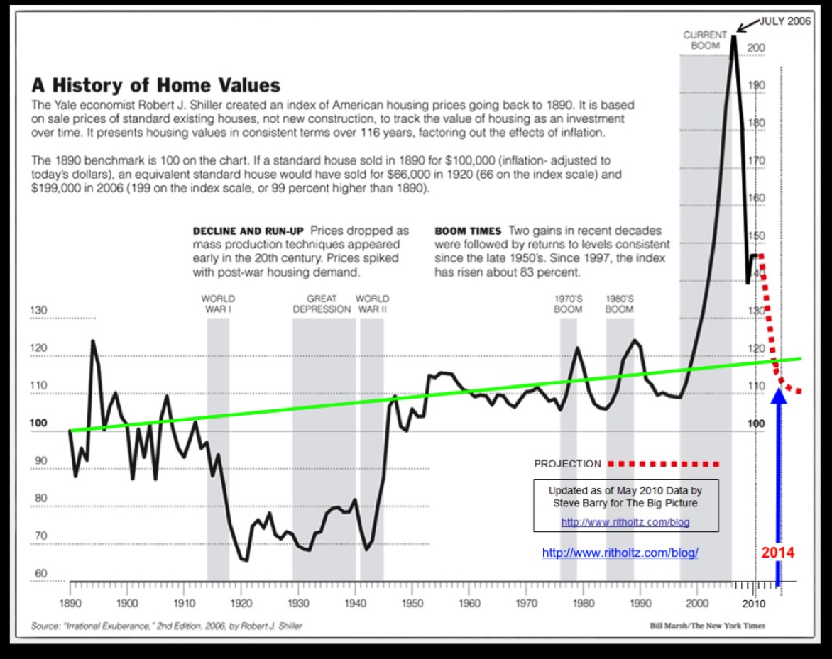
In 2007, I shared the stage with (eventual) Nobel Laureate Robert Shiller at Lincoln Center, hosted by The Real Deal (a must-read real estate resource), and spoke with him at length in the green room beforehand. We were the first speakers to arrive. Somehow, we got to talking about my love of sea kayaking, so he shared the latitude and longitude coordinates of his vacation home on an island in case I wanted to paddle by. What a flex and a very nice person! I subsequently ran into him a few times, and he joined me on my podcast a few years later.
Before the Real Deal research project 15 years ago, Robert Shiller published a second edition (now there is a third) of his best-selling book, “Irrational Exuberance,” in 2006, which introduced housing and the following chart. This modified version appeared on my friend Barry Ritholtz’s Big Picture Blog, which is also a must-read for all Housing Notes readers. The massive WWII uptick is evident in the price chart, but the later GFC Housing Bubble “surges it to shame.”
Here’s a super macro question: Can we align the deep troughs on the chart above to the “Great Depression” and the “Great Financial Crisis” on Wall Street?
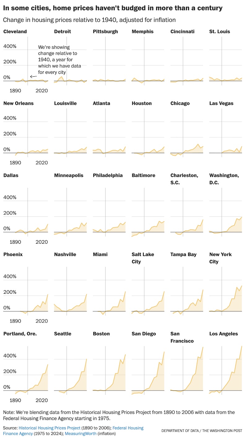
The Washington Post took a look at millions of classified ads (I used the same approach for my Manhattan article!) The cities where home prices have changed the most (and least) over the past 130 years [free with registration] and compared the results of thirty cities against the Shiller results. This article has some incredible charts.

The following chart is also spectacular. Notice how many cities have not seen price gains after inflation adjustment? The lack of price performance in the Midwest reveals a lot of the region’s political agitation. Someone once told me years ago (I can’t remember who) that the US housing market is like the cross section of a canoe. The edges (the coasts) see a lot more volatility than the center.
Final Thoughts
This week, a brokerage firm released a study revealing that about one-third of Manhattan condo resales have sold for less over the past decade. I got peppered with questions by audiences of real estate agents/brokers this week about the findings even though there is no report available online. This got me thinking and this post is the result. In a market that has been fundamentally stable for a decade, (a little up, a little down) many submarkets can show losses while the region’s aggregate results remain stable. In my long-term data work, I constantly see this “negativity bias” in action (aka “the Red Light Theory”), with the tendency to focus on downturns. Even though there is a premium focus for new, updated current data, historic trends that better enables new data to be understood with proper context. Such context is crucial in understanding current market headlines.
The Actual Final Thought – Even though I evangelize that “Pie>Cake” I do have one exception because there are…trumpets (not crumpets).

StreetMatrix Arrives In California
Here’s the latest newsletter with links to all our resources. More specifics on this effort to come!
[Podcast] What It Means With Jonathan Miller
The Be Wary Of The Screams For RTO episode is just a click away. The podcast feeds can be found here:
Did you miss the previous Housing Notes?
Housing Notes Reads
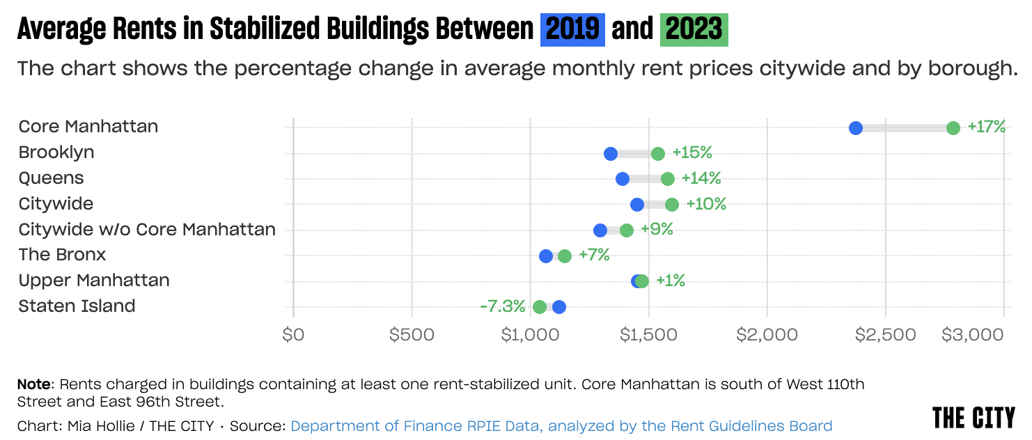
- How a Rent Freeze for Some Tenants Would Fuel Hikes for Others [The City]
- The Richest Have the Rosiest Outlook. 62% Expect to Be Richer a Year From Now. [Mansion Global]
- Are wages keeping up with inflation? [USAFacts]
- Tariff costs to companies this year to hit $1.2 trillion, with consumers taking most of the hit, S&P says [CNBC]
Market Reports
- Elliman Report: Orange County Sales 3Q 2025 [Miller Samuel]
- Elliman Report: Los Angeles Sales 3Q 2025 [Miller Samuel]
- Elliman Report: Hamptons Sales 3Q 2025 [Miller Samuel]