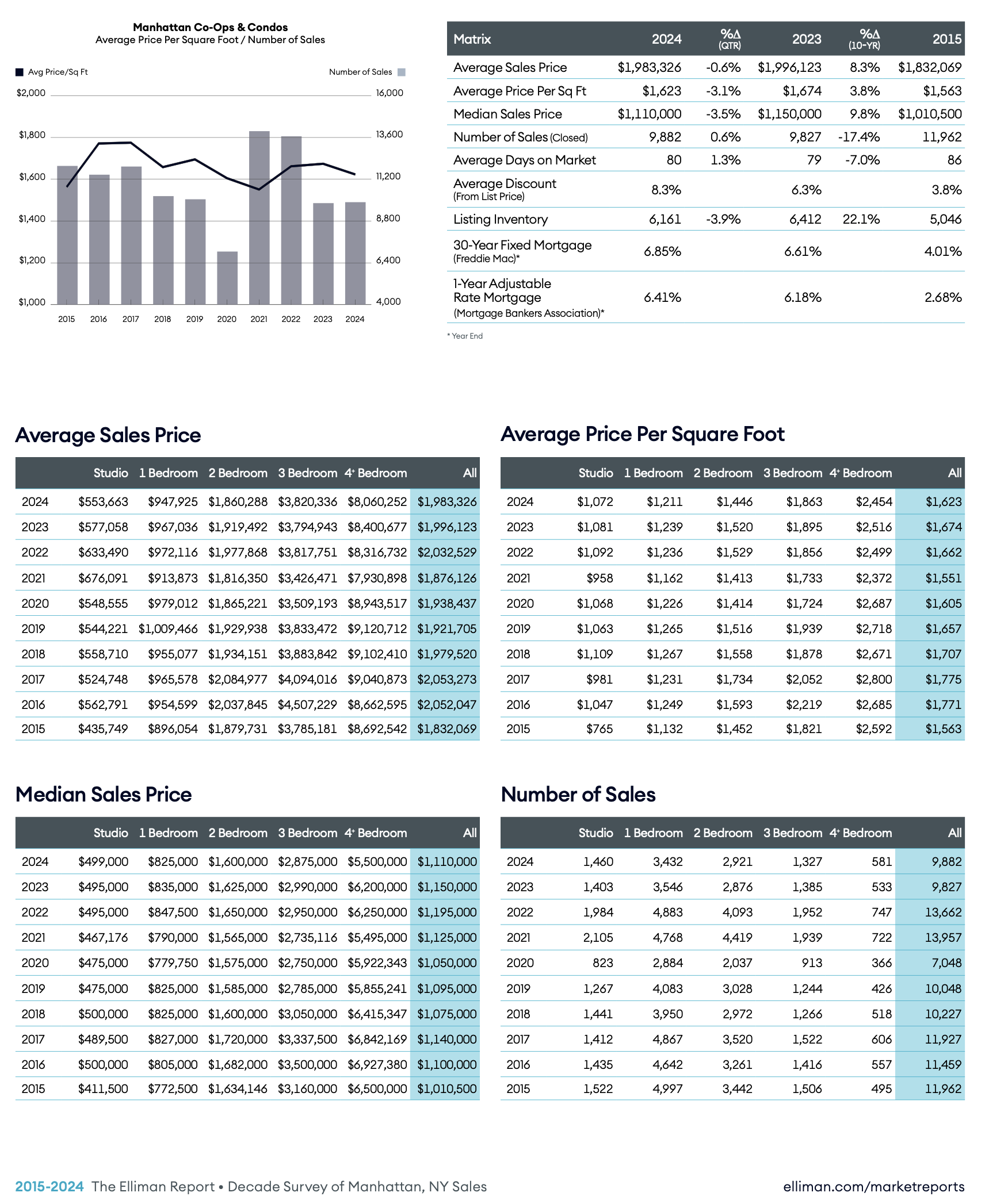
- Manhattan Price Trends And Listing Inventory Slid As Sales Edged Higher.
- Sales Of Four Or More Bedrooms Experienced The Most Significant Increase.
- The Slew Of New Ways To Look At Data Doesn’t Seem To Keep Most Any More Informed
This week, we released our 58-page Manhattan Decade Report, a ten-year moving window of annual housing market results of the Big Apple. At each yearly launch, I eventually give up and wax poetic about how I used to call this report the “phone book,” even though half of my readership is too young to get the reference. Well, I get it. This report is a static data resource that still gets a lot of interest because it is evergreen. Now, there are also a number of dynamic market NYC reports available, like those by my friends at Marketproof and Urban Digs. The very idea that consumers now have so much information available to them versus 30 years ago when I first started pushing out reports is fantastic – what a time we’re living in! Of course, being awash in data doesn’t mean consumers are actually more informed!
I’ve always maintained that my firm is not a data company but an insight company. Insights are much harder to commoditize. Data is a commodity that, over time, becomes less valuable.
Manhattan apartment price trends have become less volatile over the past twenty years.

Why Should You Care About The Manhattan Housing Market?
Made you look!
You do not need to care, but the way I analyze the market might give you ideas on how to analyze yours. What makes Manhattan quite challenging to follow is that the quality of data is really awful, and information is spread across many platforms, with some platforms being just horrible. As my Dad used to say, New Yorkers often screw over their next-door competitors but do business with the person across the street.
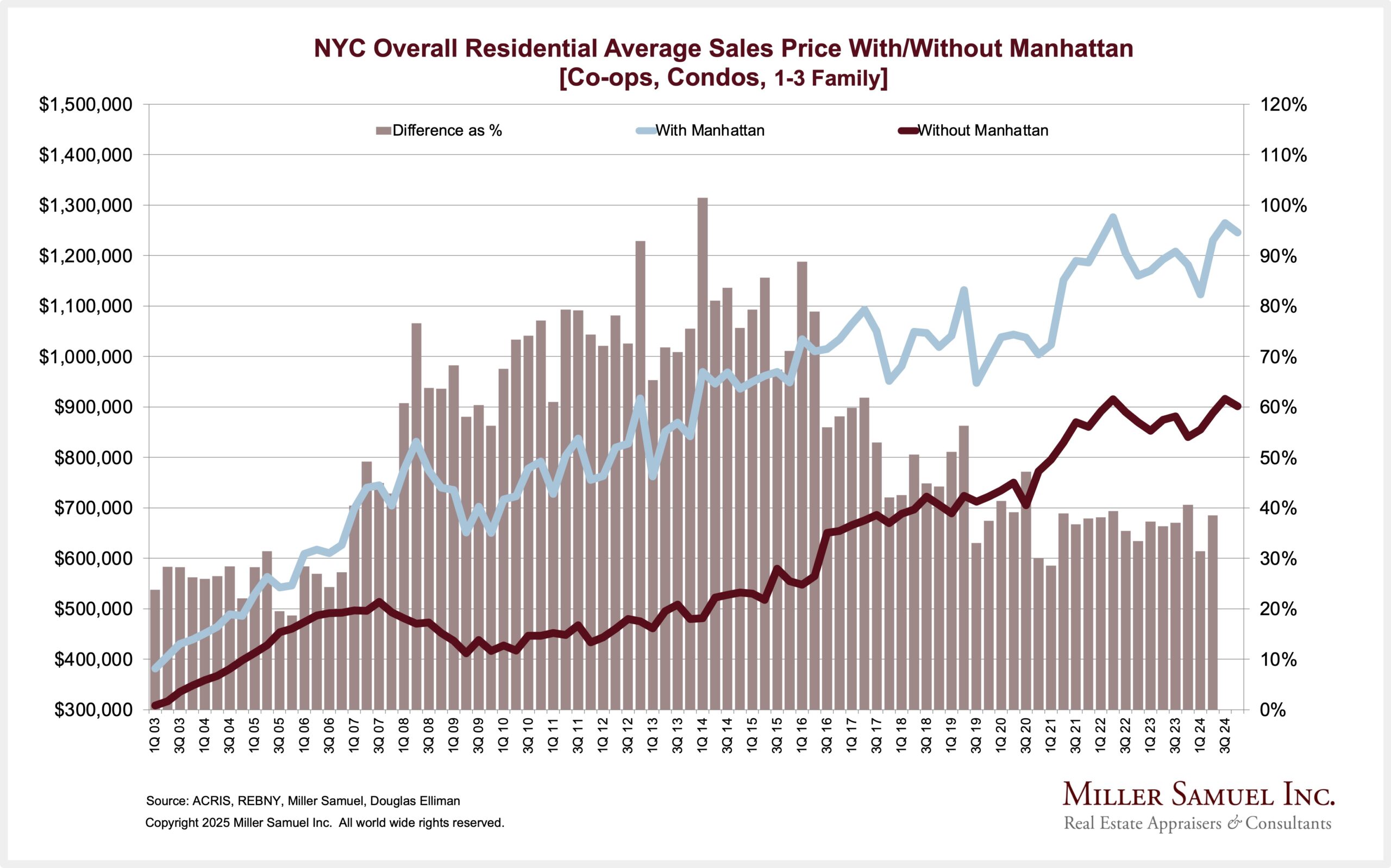
NYC Is Not Manhattan – A Simple Scroll Through The Charts
Here’s a way to think about Manhattan in the context of NYC since many people outside of New York see Manhattan and NYC as the same place.
The columns in the following chart represent NYC’s average sales price with and without Manhattan.
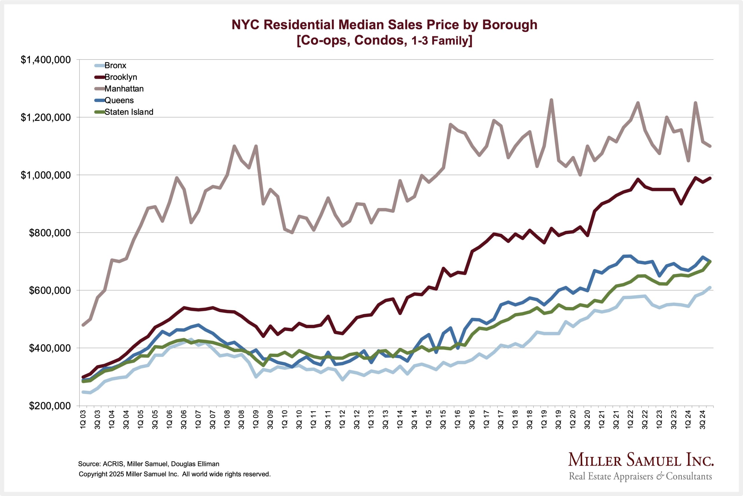
Manhattan is far more expensive than the other boroughs, but Brooklyn is quickly gaining in median price.
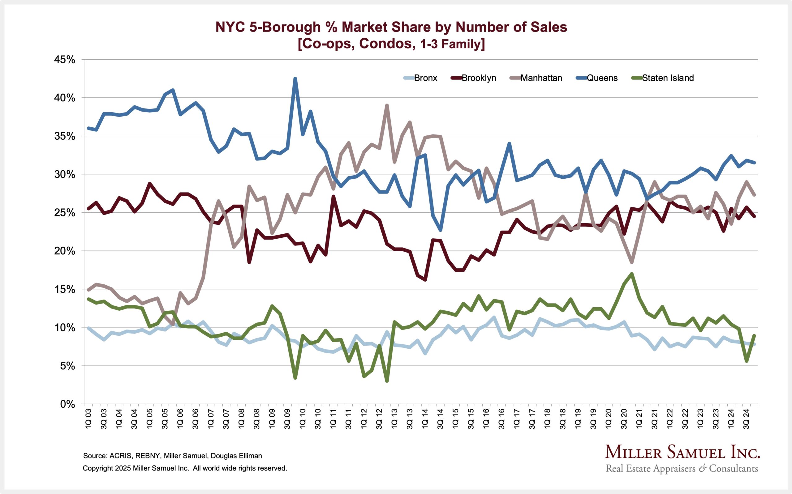
Sales surged during the pandemic, especially in the three highest-priced boroughs: Manhattan, Brooklyn, and Queens.
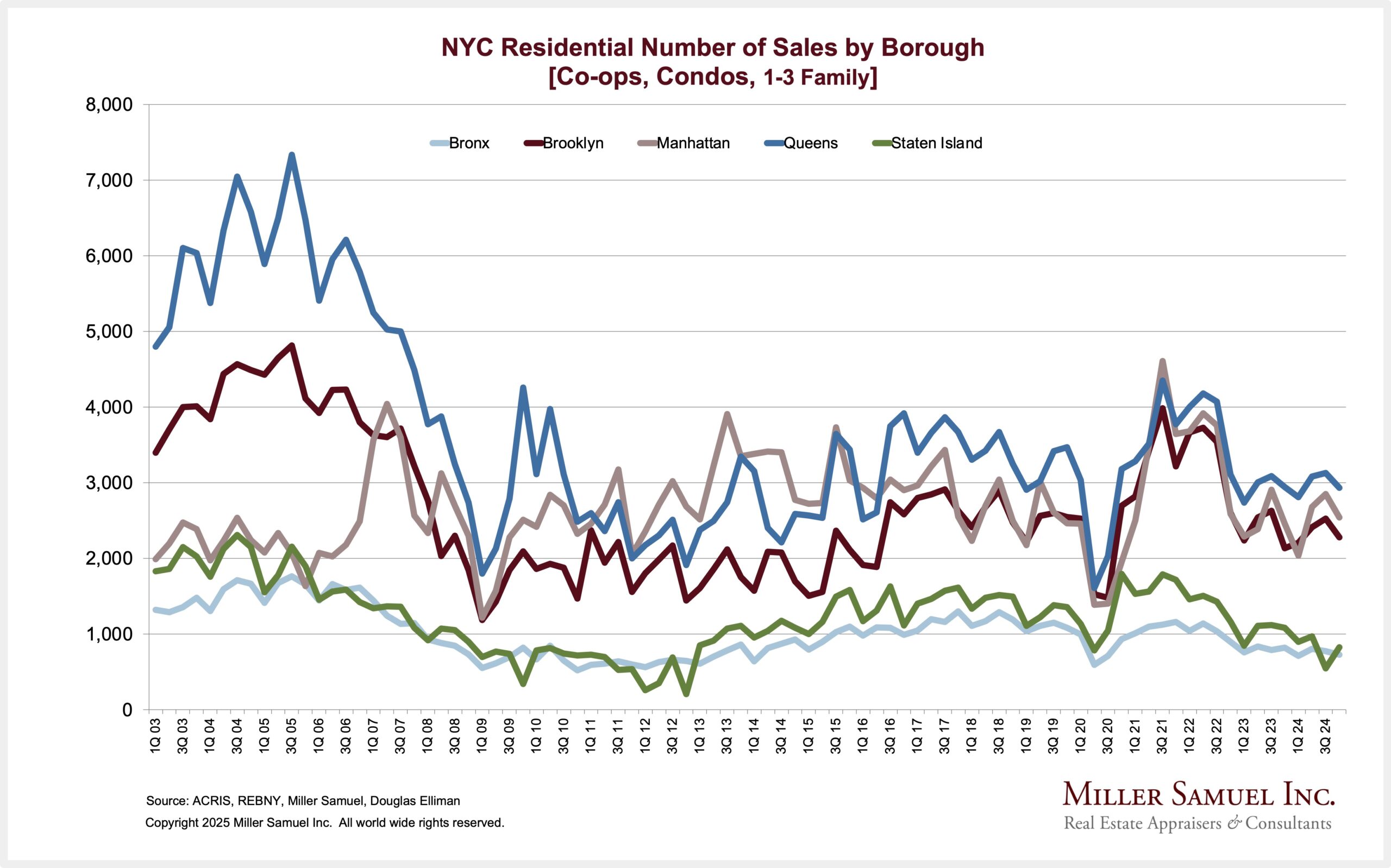
Coming out of the pandemic, the highest market share of sales belongs to Queens.
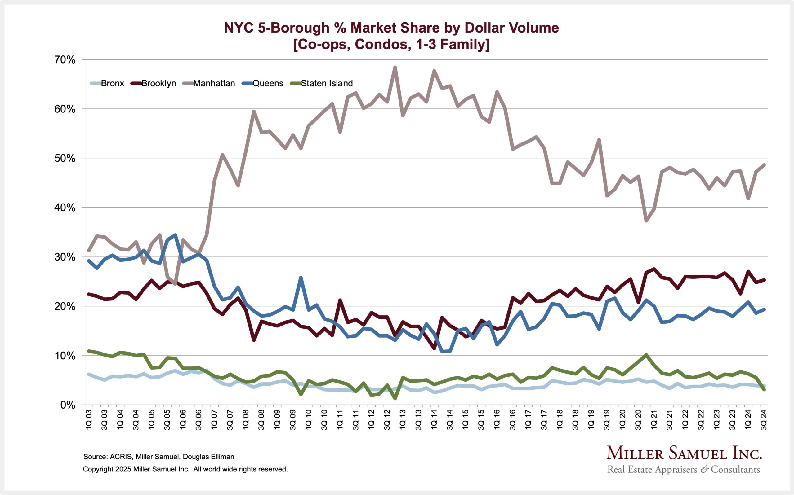
The following chart is the most amazing illustration of the impact of new development. While there has been a lot of new development in the outer boroughs, their focus has been on rentals/ The dollar volume of Manhattan sales (total sales x average sales price) was incredible, literally redefining aggregate price levels for the borough. While its dollar volume has settled a bit, it remains the only borough where dollar volume remains well above pre-2007 levels.
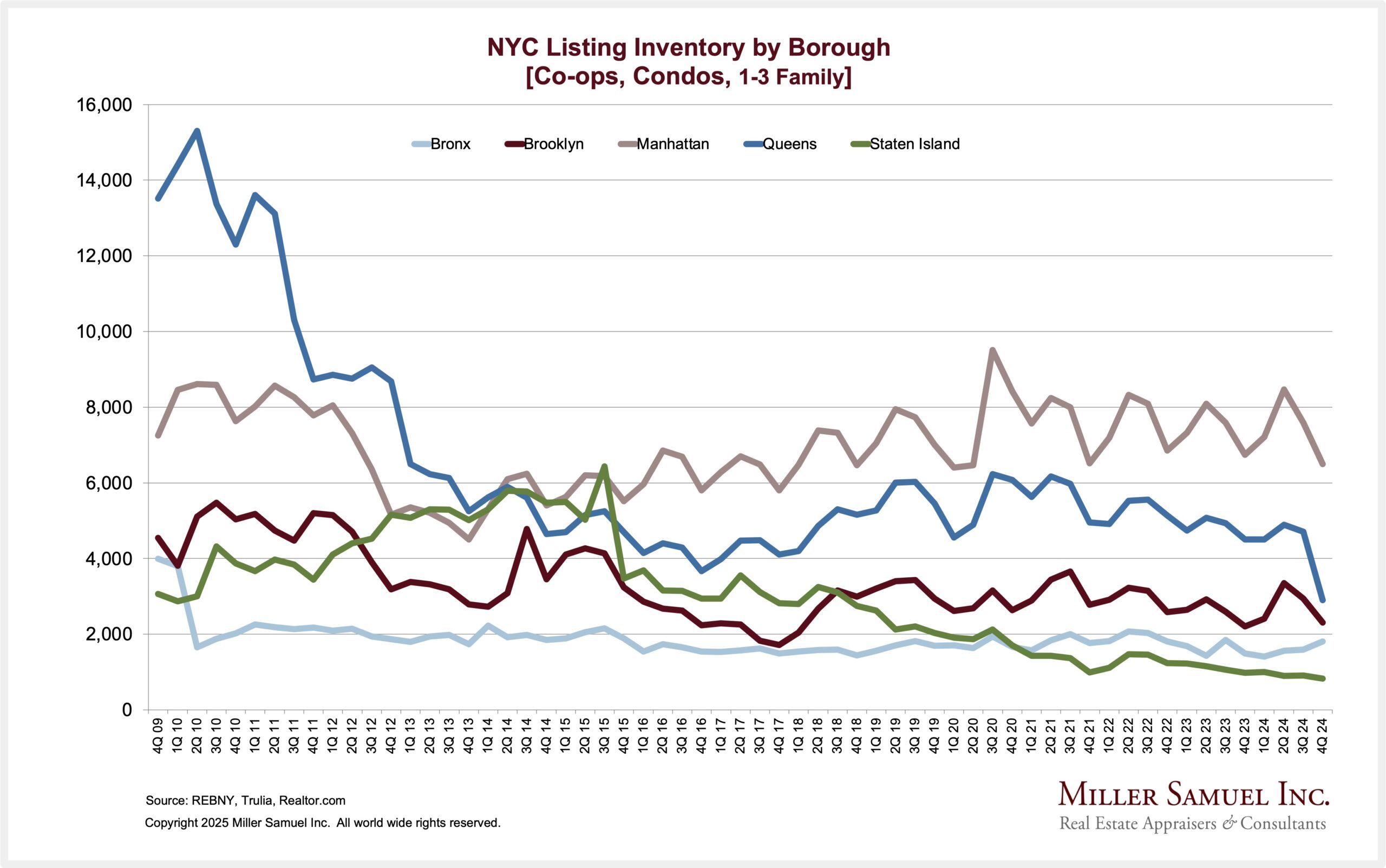
Listing inventory has continued to remain flat or sliding since 2019.
Final Thoughts
I’ve been presenting various versions of the Manhattan Decade Report since 1995. It’s static yet ever-changing, giving context to the NYC regional market.
To help navigate static versus dynamic market reports, perhaps the reversible belt analogy helps clarify. Yes, I used to own one.
Did you miss the previous Housing Notes?

Housing Notes Reads
- LA fires: What we know so far, and what’s ahead for housing [Real Estate News]
- Exclusive | Shortly After Listing, a Ferrari-Inspired Florida Home Fetches Full $55 Million Ask [WSJ]
- Is the stigma of a Trump-branded condo waning in Manhattan? [The Real Deal]
- The Trump Name May No Longer Be a Stain on Real Estate [Curbed]
- Millennials and remote work drive ‘lifestyle’ buying in luxury real estate [CNBC]
- The tariff threat [CNBC]
- When Your House Burns Down, How Do You Replace the Irreplaceable? [WSJ]
Market Reports
- Elliman Report: Manhattan Decade 2015-2024 [Miller Samuel]
- Elliman Report: Orange County Sales 4Q 2024 [Miller Samuel]
- Elliman Report: Los Angeles Sales 4Q 2024 [Miller Samuel]
- Elliman Report: Long Island Sales 4Q 2024 [Miller Samuel]
- Elliman Report: North Fork Sales 4Q 2024 [Miller Samuel]
- Elliman Report: Hamptons Sales 4Q 2024 [Miller Samuel]
- Elliman Report: Wellington Sales 4Q 2024 [Miller Samuel]
- Elliman Report: Boca Raton Sales 4Q 2024 [Miller Samuel]
- Elliman Report: Naples Sales 4Q 2024 [Miller Samuel]
- Elliman Report: Fort Lauderdale Sales 4Q 2024 [Miller Samuel]
- Elliman Report: Weston Sales 4Q 2024 [Miller Samuel]
- Elliman Report: St. Petersburg Sales 4Q 2024 [Miller Samuel]
- Elliman Report: Delray Beach Sales 4Q 2024 [Miller Samuel]
- Elliman Report: Miami Beach Sales 4Q 2024 [Miller Samuel]
- Elliman Report: Vero Beach Sales 4Q 2024 [Miller Samuel]
- Elliman Report: West Palm Beach Sales 4Q 2024 [Miller Samuel]
- Elliman Report: Coral Gables Sales 4Q 2024 [Miller Samuel]
- Elliman Report: Lee County Sales 4Q 2024 [Miller Samuel]
- Elliman Report: Manhattan, Brooklyn & Queens Rentals 12-2024 [Miller Samuel]
- Elliman Report: Brooklyn Sales 4Q 2024 [Miller Samuel]
- Elliman Report: Queens Sales 4Q 2024 [Miller Samuel]
- Elliman Report: Florida New Signed Contracts 12-2024 [Miller Samuel]
- Elliman Report: Manhattan Sales 4Q 2024 [Miller Samuel]
- Elliman Report: New York New Signed Contracts 12-2024 [Miller Samuel]


![[Podcast] Episode 4: What It Means With Jonathan Miller](https://millersamuel.com/files/2025/04/WhatItMeans.jpeg)